

Mobile POS
The same Fexl Lite codebase runs on a phone browser. There’s no separate mobile app to install — open app.fexl.io (or your tenant’s subdomain), log in, and the POS responds to the screen size. The mobile layout drops a few desktop-only features for clarity and bumps a few others into reach of a thumb.
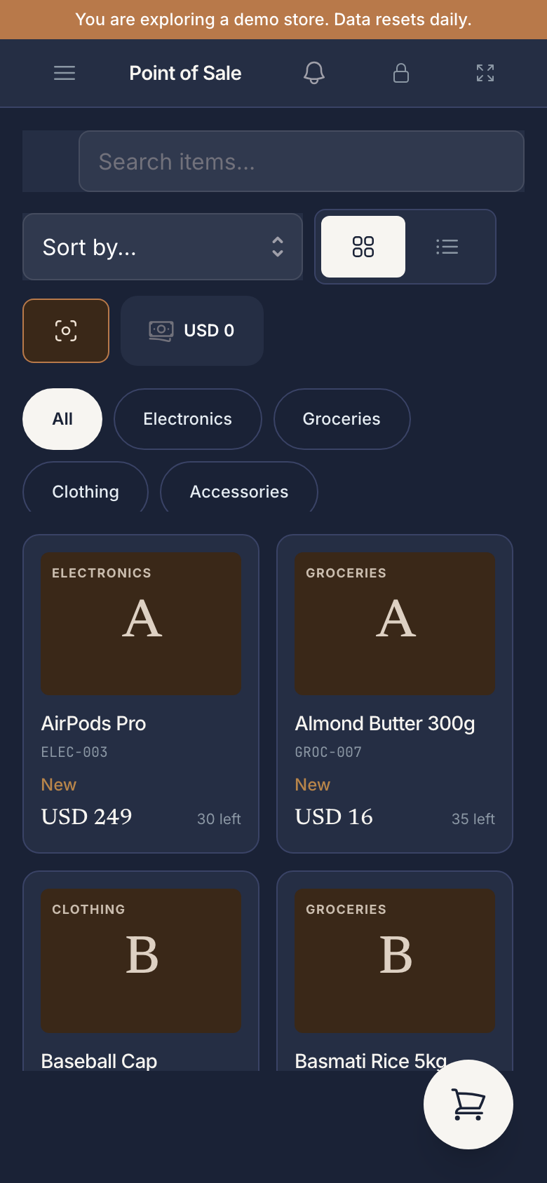
Single-panel layout
On a phone (under ~768 px wide), the POS uses a single-panel mode: you’re either looking at the product grid or at the cart, never both at once. A tab switcher at the bottom flips between Products and Cart. Adding an item from the grid bumps the cart-tab badge so you can see how full the cart is without leaving the grid.
On a tablet in landscape, the layout is the desktop two-panel one with both visible side-by-side. In portrait, it’s still two panels but with narrower columns.
Camera barcode
The cart header has a camera icon. Tap it; the browser asks for camera permission; aim at a barcode; the cart updates as soon as the camera resolves it. Same matching rules as a USB scanner — see Barcode scanning for the search-field configuration.
The first scan triggers the OS camera-permission prompt. Allow it; subsequent scans skip the prompt. If you decline, the camera button stays visible but throws an error toast on tap until you re-enable the permission in browser settings.
What’s simplified on mobile
Some desktop conveniences are deliberately absent because they don’t fit a phone:
- Multi-cart is hidden. A phone is one register, in one hand, serving one customer. The “Cart 1 / Cart 2” tab switcher disappears entirely on phone widths. If you need parallel carts, run the desktop layout — see Multi-cart & holds.
- Reduced sidebar. The full app sidebar collapses behind a hamburger menu. POS, Customers, and Invoices are all reachable; the long tail (settings, accounting, reports) is one tap deeper.
- No keyboard shortcuts. F9 , Ctrl Shift D , etc. — these don’t fire on touch devices, even if you’ve paired a Bluetooth keyboard. The screen buttons are the path.
- No USB receipt printer. Tauri-only. On mobile web, the Print button generates a PDF receipt that downloads or opens in the OS share sheet — print to a Bluetooth thermal printer via the OS’s normal print flow, or email it.
What’s the same
- Product browsing, search, category filter — all there, with bigger tap targets.
- Variant / batch / serialized pickers — same dialogs, scaled to screen.
- Checkout — full / partial / split, all unchanged. The dialog goes full-screen on phone.
- Customer attach, including create on the fly.
- Discount, delegate, backdate — all the cart-side fields are present.
- Cash drawer shifts — open / close / cash-in-and-out work the same.
Performance
The mobile layout is not a separate bundle — it’s the same JS, same React tree, with media-query CSS and a useIsMobile() hook gating layout. Cold start is identical to desktop web (~2–3 s on a mid-range Android over Wi-Fi). Service-worker caching kicks in after the first load; subsequent opens are sub-second.